Introduction: A Visual Journey Through Color
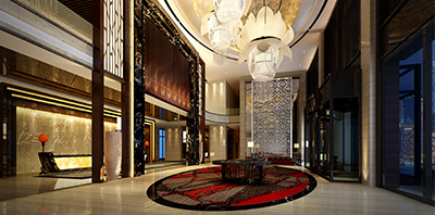
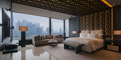
Every year, the Salone Internazionale del Mobile in Milan showcases the latest trends in furniture and design, attracting enthusiasts and professionals from around the globe. One of the standout themes in recent exhibitions has been the innovative use of color in design elements. This article explores how natural world-inspired color palettes—earth tones, greens, blues, and sunset hues—have been creatively applied to enhance and accentuate the organic forms of lighting fixtures, adding a new layer of depth and interaction to their designs.
Understanding Color Psychology in Design
The Impact of Earth Tones
Earth tones encompass a palette derived from nature itself, including browns, tans, warm grays, and greens. In the context of the Salone Internazionale del Mobile, these colors have been used to evoke a sense of stability and grounding. Designers use these hues to create pieces that speak of comfort and tranquility, making any space feel more welcoming.
Green: The Color of Balance
Green, a color central to the natural world, has been used extensively to inspire feelings of harmony and renewal. From olive to forest green, lighting designs featuring these shades can transform the ambiance of a room, simulating the calming effect of being in nature.
Blue: The Breath of Serenity
Blues, particularly those reminiscent of the sky and sea, bring a breath of serenity to interiors. At the Salone, designers have used blues to craft lighting fixtures that provide a cooling effect, perfect for creating a soothing retreat in urban environments.
Sunset Hues: Warmth and Vibrancy
Sunset hues—ranging from soft pinks to fiery oranges and deep purples—introduce a dynamic energy into lighting designs. These colors are often used to make bold statements, drawing the eye and becoming the focal points in minimalist or neutral spaces.
Case Studies: Real-Life Examples from the Salone
Earth Tones in Action
One notable example is a chandelier series that utilizes sandy browns and muted greens, designed to mimic the look of stones and moss in a riverbed. The natural color scheme helps integrate the fixture seamlessly into both modern and rustic decors.
Green’s Versatility
At a recent Salone, a series of pendant lights featured varying shades of green, using glass with natural textures to enhance the color’s depth. These pieces perfectly illustrate how green can adapt to different styles and preferences.
The Calm of Blues
Another highlight was a collection of table lamps in sky blue, designed to reflect the serenity of the Mediterranean. The designers used a gradient effect to give the illusion of light filtering through water, showcasing the versatility of blue in evoking different aspects of the natural world.
Sunset Colors: A Study in Contrast
A particularly striking installation featured floor lamps with shades transitioning from a soft peach to a vibrant sunset orange, creating a warm, inviting glow that mimics the end of the day. This use of color not only enhances the lamp’s visual appeal but also its ability to affect mood and atmosphere.
Integrating Natural Colors in Home Decor
Tips for Using Earth Tones
To incorporate earth tones in home lighting, consider fixtures with natural materials like wood or ceramic. These materials naturally complement earthy colors and help anchor a space.
Decorating with Greens
For those looking to bring a touch of the outdoors inside, green-accented lighting can be paired with indoor plants and natural wood finishes to enhance the organic feel.
Bringing in the Blues
Blue lighting works well in areas designed for relaxation, such as bedrooms or reading nooks. Pair these fixtures with soft textiles to amplify the calming effect.
Using Sunset Hues
Sunset-colored lighting can be dramatic, so it’s best used in spaces where you want to create an impact, such as dining areas or living rooms. Pair with simple, modern furniture to let the colors truly pop.
Conclusion: The Future of Color in Design
The innovative use of color at the Salone Internazionale del Mobile highlights a broader trend in design: a shift towards integrating natural elements and hues in everyday objects to enhance emotional and aesthetic appeal. This movement not only beautifies spaces but also connects us more deeply to the natural world through our environments.
FAQs
1. What are earth tones?
Earth tones refer to a color palette that includes neutral, muted hues such as beige, tan, various shades of brown, and muted greens, which are derived from natural elements.
2. How can I use blue lighting to improve my home environment?
Blue lighting is excellent for creating a relaxing atmosphere. It’s ideal for bedrooms or bathrooms where calm is paramount. Pair these fixtures with soft, neutral décor to enhance the tranquility.
3. What are the best ways to incorporate green into my lighting design?
Green lighting can be integrated through the use of colored glass or painted finishes. It pairs beautifully with natural materials like wood and is great in spaces that have floral or plant elements.
4. Can sunset hues be too overwhelming for small spaces?
While vibrant, sunset hues can be used effectively in small spaces by focusing on accent pieces rather than full-room color schemes. Consider using them in lampshades or pendant lights.
5. Are there color trends predicted for the next Salone Internazionale del Mobile?
While specific trends can vary year to year, the movement towards sustainable and natural color palettes seems to be continuing. Expect to see more innovations in how these hues are applied to modern design.